It has been 515 days since the last update, the content of the article may be outdated.
这里实战的网站是小米商城。
首先是项目的搭建
项目的搭建
1
2
3
4
5
6
7
8
9
10
11
12
13
| <!DOCTYPE html>
<html lang="en">
<head>
<meta charset="UTF-8">
<title>Title</title>
<link rel="shortcut icon" href="img/favicon.ico" type="image/x-icon">
<link rel="stylesheet" href="css/common.css">
</head>
<body>
</body>
</html>
|
引入favicon和css,这个commoncss就是一个公共的css。
项目作用
- 熟悉大部分基本样式的使用
- 体会布局中的细节处理
- 找到写页面的感觉
成为一个合格的页面重构师
公共样式
所有的公共样式书写到 common.css 中
统一样式
1
2
3
4
5
6
7
8
9
10
11
12
13
14
15
16
17
18
19
| * {
margin: 0;
padding: 0;
list-style: none;
box-sizing: border-box;
}
a {
text-decoration: none;
color: inherit;
}
a:hover {
color: ##ff6700;
}
html {
color: ##333;
min-width: 1226px;
font: 14px/1.5 'Helvetica Neue', Helvetica, Arial, 'Microsoft Yahei',
'Hiragino Sans GB', 'Heiti SC', 'WenQuanYi Micro Hei', sans-serif;
}
|
这里的list-style: none;就是可以清除小点。

a元素里面的color: inherit;这个是在之前的属性计算里面讲过
浮动处理
1
2
3
4
5
6
7
8
9
10
11
| .fl {
float: left;
}
.fr {
float: right;
}
.clearfix::after {
content: '';
display: block;
clear: both;
}
|
通用容器
1
2
3
4
5
| .container {
width: 1226px;
margin-left: auto;
margin-right: auto;
}
|
这个是小米商城上有很多都符合这个特征。
字体图标
这部分属于CSS3的知识,现阶段只需要知道如何使用即可
在页面所有样式之前引入一个CSS
https://at.alicdn.com/t/font_2960521_rqz39d8moo.css
打开「字体图标.html」找到自己想使用的图标,复制它对应的类样式
设置任何一个元素的类样式为:iconfont + 对应的图标类样式 即可
学会设置图标的大小、颜色
顶部导航
首先弄的是这个区域
主区域
1
2
3
4
5
6
7
8
9
10
| <div class="topnav">
<div class="container clearfix">
<ul class="fl topnav-menu">
</ul>
<div class="fr">
</div>
</div>
</div>
|
可以看到,fl左浮动对应的就是左边的区域,fr右浮动就是对应的右边的区域。
那么浮动后,就有可能造成高度的坍塌,所以要给父元素加一个清除浮动。这里的ul class=”fl topnav-menu”>。这个是一个取名的技巧,就是用父元素的名字加上本意名字,可以有效的避免重名。
之后就是一些技术活。下面给出一些。但是要注意加上左浮动和右浮动。
1
2
3
4
5
6
7
8
9
10
11
12
13
14
15
16
17
18
19
|
<li><a href="">小米商城</a></li>
<li><a href="">MIUI</a></li>
<li><a href="">IoT</a></li>
<li><a href="">云服务</a></li>
<li><a href="">天星数科</a></li>
<li><a href="">有品</a></li>
<li><a href="">小爱开放平台</a></li>
<li><a href="">企业团购</a></li>
<li><a href="">资质证照</a></li>
<li><a href="">协议规则</a></li>
<li><a href="">下载app</a></li>
<li><a href="">智能生活</a></li>
<li><a href="">Select Location</a></li>
<li><a href="">登录</a></li>
<li><a href="">注册</a></li>
<li><a href="">消息通知</a></li>
|
样式标注
之后我们开始写css了。
1
2
3
4
5
6
7
8
9
10
11
12
13
14
15
16
17
18
19
20
21
22
23
24
25
| .topnav{
background: ##333;
height: 40px;
color: ##b0b0b0;
font-size: 12px;
}
.topnav-menu{
line-height: 40px;
}
.topnav-menu a{
padding: 0 7px;
border-right: 1px solid ##424242;
}
.topnav-menu li:last-child a{
border-right: none;
}
.topnav-menu li:first-child a{
padding-left: 0;
}
.topnav-menu a:hover{
color: white;
}
|
只要根据那个图进行制作就没有了。
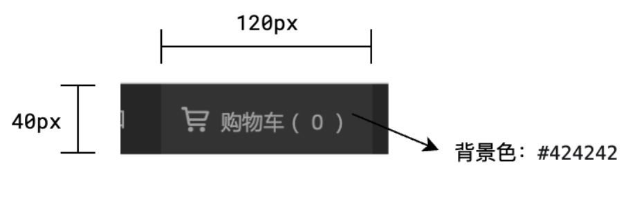
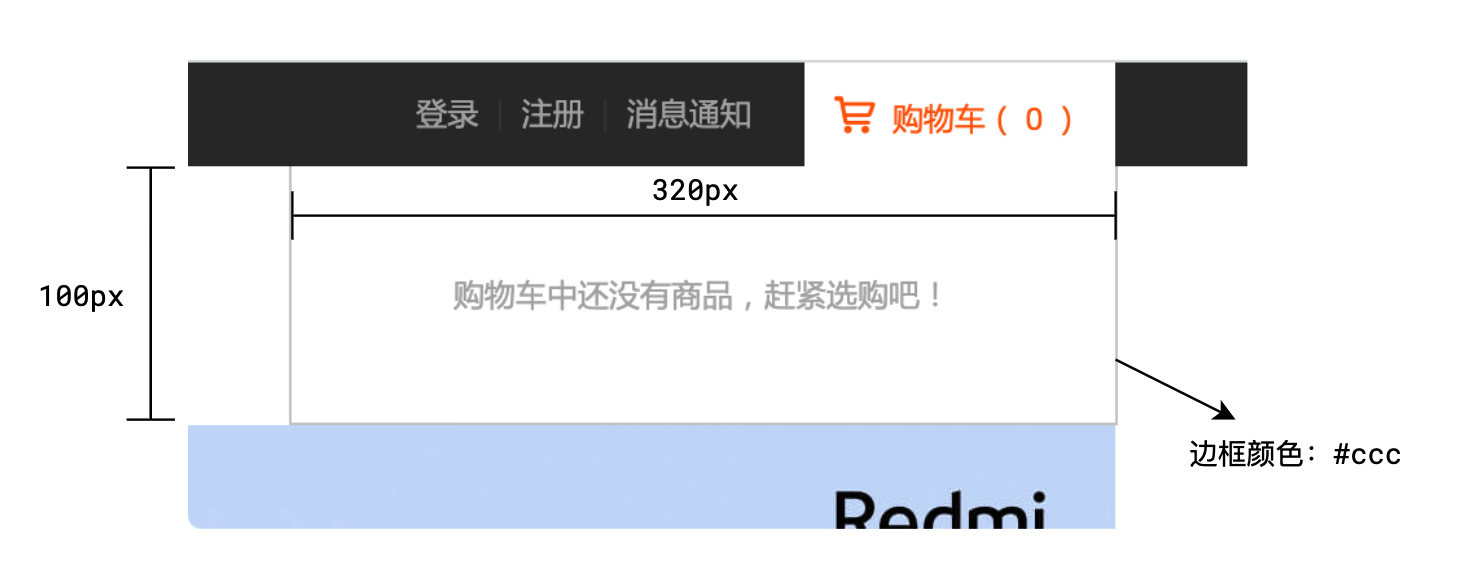
购物车
元素结构和布局
样式标注
我们根据上面的图来进行制作购物车。
1
2
3
4
5
6
7
8
9
10
|
<div class="fl topnav-car">
<a href="">
<i class="iconfont i-car"></i>
<span>购物车(0)</span>
</a>
<div class="topnav-detail">
购物车中还没有商品,赶紧选购把
</div>
</div>
|
元素结构就是这样的。
之后看css
1
2
3
4
5
6
7
8
9
10
11
12
13
14
15
16
17
18
19
20
21
22
23
24
25
26
27
28
29
30
31
32
33
34
35
36
37
38
39
40
41
42
|
.topnav-car{
background: ##424242;
width: 120px;
height: 40px;
margin-left: 13px;
position: relative;
}
.topnav-link{
width: 100%;
height: 100%;
display: block;
text-align: center;
line-height: 40px;
}
.topnav-link .iconfont{
margin-right: 3px;
}
.topnav-detail{
background: ##ffffff;
position: absolute;
width: 320px;
height: 100px;
right: 0;
top: 40px;
border: 1px solid ##cccccc;
border-top: none;
text-align: center;
line-height: 100px;
display: none;
z-index: 50;
}
.topnav-car:hover .topnav-detail{
display: block;
}
.topnav-car:hover .topnav-link{
background: ##ffffff;
}
|
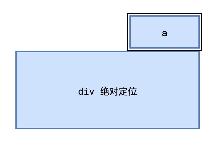
这里需要注意的是,z-index的问题,就是可以进行一个人为的规定,例如弹出菜单2位数,然后固定菜单三位数这样的设定,如果不设置,会导致后面的元素覆盖掉前面的,可能会达不到我们想要的效果。
头部导航
头部-Logo和菜单
部分HTML内容
1
2
3
4
5
6
7
8
9
| <a href="">小米手机</a>
<a href="">红米手机</a>
<a href="">电视</a>
<a href="">笔记本</a>
<a href="">平板</a>
<a href="">家电</a>
<a href="">路由器</a>
<a href="">服务</a>
<a href="">社区</a>
|
样式标注
1
2
3
4
5
6
7
8
9
10
11
12
13
14
15
16
17
18
19
20
21
22
23
24
25
| .header{
height: 100px;
}
.header-logo h1{
display: none;
}
.header-logo{
background: url("../img/logo.png");
width: 56px;
height: 56px;
background-size: 100% 100%;
margin-top: 22px;
margin-right: 172px;
}
.header-menu a{
height: 100px;
line-height: 100px;
padding: 0 7px;
font-size: 16px;
}
|
这里没什么好说的
之后我们做二级菜单区域
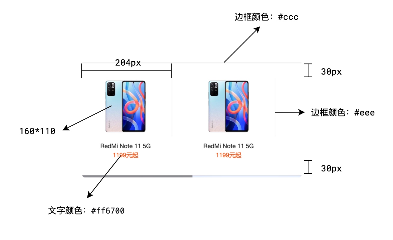
二级菜单
样式标注
首先是=html结构
1
2
3
4
5
6
7
8
9
10
11
12
13
14
15
16
17
18
19
20
21
22
23
24
25
26
27
28
29
30
31
32
33
34
35
36
37
38
39
40
41
42
43
44
45
46
47
|
<div class="header-submenu">
<div class="container clearfix">
<a href="" class="fl">
<div class="header-cover">
<img src="./img/product.webp" alt="">
</div>
<div class="header-name">Redmi Note 11 5G</div>
<div class="header-price">1199元起</div>
</a>
<a href="" class="fl">
<div class="header-cover">
<img src="./img/product.webp" alt="">
</div>
<div class="header-name">Redmi Note 11 5G</div>
<div class="header-price">1199元起</div>
</a>
<a href="" class="fl">
<div class="header-cover">
<img src="./img/product.webp" alt="">
</div>
<div class="header-name">Redmi Note 11 5G</div>
<div class="header-price">1199元起</div>
</a>
<a href="" class="fl">
<div class="header-cover">
<img src="./img/product.webp" alt="">
</div>
<div class="header-name">Redmi Note 11 5G</div>
<div class="header-price">1199元起</div>
</a>
<a href="" class="fl">
<div class="header-cover">
<img src="./img/product.webp" alt="">
</div>
<div class="header-name">Redmi Note 11 5G</div>
<div class="header-price">1199元起</div>
</a>
<a href="" class="fl">
<div class="header-cover">
<img src="./img/product.webp" alt="">
</div>
<div class="header-name">Redmi Note 11 5G</div>
<div class="header-price">1199元起</div>
</a>
</div>
</div>
|
之后来看css
1
2
3
4
5
6
7
8
9
10
11
12
13
14
15
16
17
18
19
20
21
22
23
24
25
26
27
28
29
30
31
32
33
34
35
36
37
38
39
40
41
42
43
44
45
46
47
48
49
50
51
52
53
54
55
56
57
58
59
60
61
62
63
64
65
66
67
68
69
70
71
72
73
74
75
| .header {
height: 100px;
position: relative;
}
.header-logo h1 {
display: none;
}
.header-logo {
background: url("../img/logo.png");
width: 56px;
height: 56px;
background-size: 100% 100%;
margin-top: 22px;
margin-right: 172px;
}
.header-menu > a {
height: 100px;
line-height: 100px;
padding: 0 7px;
font-size: 16px;
}
.header-submenu {
position: absolute;
left: 0;
width: 100%;
top: 100px;
border-top: 1px solid ##ccc;
border-bottom: 1px solid ##ccc;
padding: 30px 0;
display: none;
}
.header-cover img {
width: 160px;
height: 110px;
}
.header-submenu a {
width: 204px;
text-align: center;
font-size: 12px;
}
.header-cover {
border-right: 1px solid ##eee;
}
.header-submenu a:last-child .header-cover {
border-right: none;
}
.header-name {
margin-top: 10px;
color: ##333;
}
.header-price {
color: ##ff6700;
}
.header-menu:hover .header-submenu{
display: block;
}
|
也基本都是一个技术活的问题之后我们的z-index也要进行处理
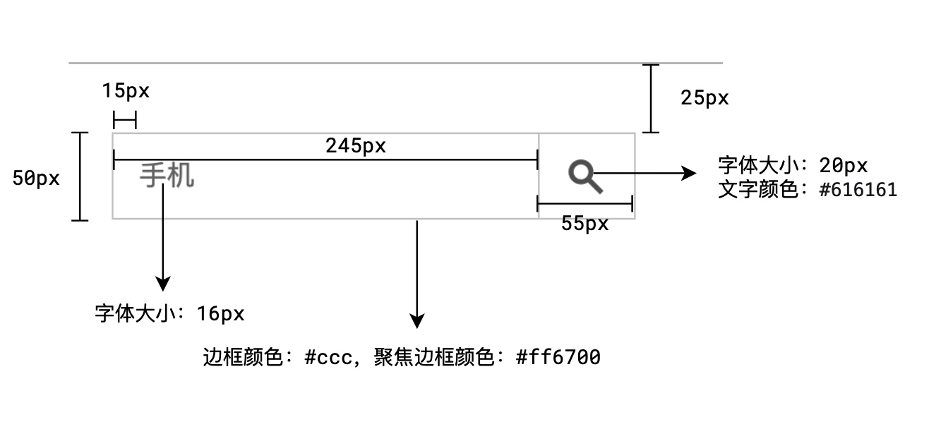
头部-搜索区域
元素结构
1
2
3
4
5
| <form class="header-search">
<input type="text" />
<button class="header-searchicon">...</button>
<div class="header-suggest">...</div>
</form>
|
1
2
3
4
5
6
7
8
9
10
11
12
13
14
15
16
17
18
19
20
21
22
|
.header-search input {
border: ...;
}
.header-searchicon {
border: ...;
border-left: none;
}
.header-suggest {
display: none;
}
.header-search input:focus {
border-color: ...;
}
.header-search input:focus ~ .header-searchicon {
border-color: ...;
}
.header-search input:focus ~ .header-suggest {
display: block;
}
|
样式标注
1
2
3
4
5
6
7
8
9
10
11
12
13
14
15
16
17
18
19
20
21
22
23
24
25
26
27
28
29
30
31
32
33
34
35
36
37
38
39
40
41
42
43
44
45
46
47
48
49
50
51
52
53
54
55
56
57
58
59
60
61
62
63
64
65
66
67
68
69
70
| *搜索框*/
.header-search{
position: relative;
margin-top: 25px;
}
.header-search input{
width: 245px;
height: 50px;
font-size: 16px;
padding: 0 15px;
outline: none;
border: 1px solid ##ccc;
}
.header-searchicon {
width: 55px;
height: 50px;
background: ##fff;
border: 1px solid ##ccc;
border-left: none;
font-size: 20px;
color: ##777;
cursor: pointer;
}
.header-search .iconfont{
font-size: 20px;
}
.header-suggest{
position: absolute;
left: 0;
top: 50px;
width: 245px;
border: 1px solid ##ff6700;
border-top: none;
z-index: 40;
background: white;
display: none;
}
.header-suggest a{
display: block;
font-size: 12px;
height: 30px;
line-height: 30px;
padding: 0 10px;
}
.header-suggest a:hover{
background: ##eee;
color: inherit;
}
.header-search input:focus~.header-suggest{
display: block;
}
.header-search input:hover{
border-color: ##aaa;
}
.header-search input:focus{
border-color: ##ff6700;
}
.header-search input:focus~.header-searchicon{
border-color: ##ff6700;
}
.header-searchicon:hover{
background: ##ff6700;
border-color: ##ff6700;
color: ##fff;
}
|
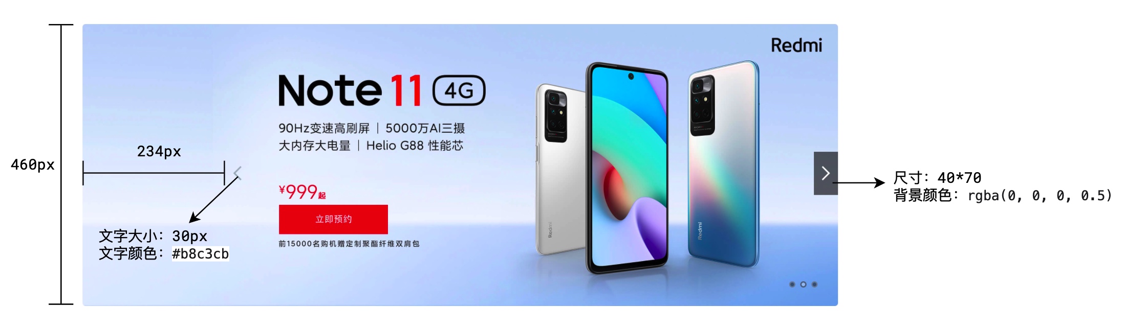
横幅
主区域
样式标注
一个大概的框架
1
2
3
4
5
6
7
8
9
10
11
12
13
14
15
16
17
|
<div class="banner container">
<a href="" class="cover">
<img src="./img/banner.jpeg" alt="">
</a>
<div class="banner-pointer banner-pointer-left">
<i class="iconfont i-left"></i>
</div>
<div class="banner-pointer banner-pointer-right">
<i class="iconfont i-right"></i>
</div>
<div class="banner-dots">
<span class="banner-dots-selected"></span>
<span></span>
<span></span>
</div>
</div>
|
之后来看css部分
1
2
3
4
5
6
7
8
9
10
11
12
13
14
15
16
17
18
19
20
21
22
23
24
25
26
27
28
29
30
31
32
33
34
35
36
37
38
39
40
41
42
43
44
45
46
47
48
49
50
| .banner{
height: 460px;
position: relative;
}
.banner-cover img{
width: 1226px;
height: 460px;
}
.banner-pointer{
position: absolute;
width: 40px;
height: 70px;
color: ##b8c3cb;
text-align: center;
line-height: 70px;
cursor: pointer;
top: 50%;
margin-top: -35px;
}
.banner-pointer .iconfont{
font-size: 30px;
}
.banner-pointer :hover{
background: rgba(0,0,0,0.5);
color: ##fff;
}
.banner-pointer-left{
left: 234px;
}
.banner-pointer-right{
right: 0;
}
.banner-dots{
position: absolute;
right: 30px;
bottom: 30px;
}
.banner-dots span{
width: 10px;
height: 10px;
background: rgba(0,0,0,.4);
border-radius: 50%;
border: 2px rgba(255,255,255,.3);
margin: 0 4px;
}
.banner-dots span.banner-dots-selected{
border-color: rgba(0,0,0,.4);
background: rgba(255,255,255,.3);
}
|
这里也没什么好说的。
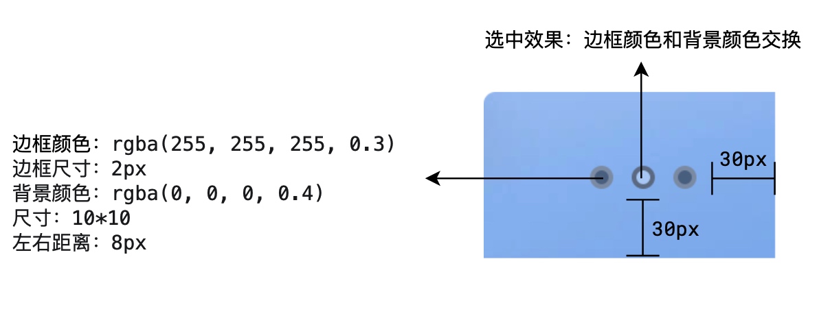
菜单
基本结构
1
2
3
4
5
6
7
| .banner-sub-menu{
display: none;
}
li:hover .banner-sub-menu{
display: block;
}
|
样式标注
1
2
3
4
5
6
7
8
9
10
11
12
13
14
15
16
17
18
19
20
21
22
23
24
25
26
27
28
29
30
31
32
33
34
35
36
37
38
39
40
41
42
43
44
45
46
47
48
49
50
51
52
53
|
.banner-menu{
width: 234px;
height: 100%;
background: rgba(105,101,101,0.6);
position: absolute;
top: 0;
left: 0;
padding: 20px 0;
}
.banner-menu-item{
color: ##fff;
padding: 0 20px 0 30px;
height: 42px;
line-height: 42px;
}
.banner-menu li:hover {
background: ##ff6700;
cursor: pointer;
}
.banner-menu li:hover .banner-sub-menu{
display: block;
}
.banner-sub-menu{
position: absolute;
top: 0;
width: 992px;
left: 234px;
height: 100%;
background: ##fff;
display: none;
}
.banner-sub-menu a{
width: 25%;
height: 16.666%;
padding: 0 20px;
}
.banner-sub-menu img{
width: 40px;
height: 40px;
margin-top: 17px;
margin-right: 12px;
}
.banner-sub-menu span{
width: 154px;
margin-top: 28px;
overflow: hidden;
text-overflow: ellipsis;
white-space: normal;
}
|
横幅 2
部分 HTML 内容
1
2
3
4
5
6
7
8
9
10
11
12
13
14
15
16
17
18
19
20
21
22
23
24
25
26
| <div class="banner2-service fl">
<a href="" class="fl">
<i class="iconfont i-shijian"></i>
保障服务
</a>
<a href="" class="fl">
<i class="iconfont i-qiye"></i>
企业团购
</a>
<a href="" class="fl">
<i class="iconfont i-Fma"></i>
F码通道
</a>
<a href="" class="fl">
<i class="iconfont i-Sim-Card"></i>
米粉卡
</a>
<a href="" class="fl">
<i class="iconfont i-yijiuhuanxin"></i>
以旧换新
</a>
<a href="" class="fl">
<i class="iconfont i-chongzhi"></i>
话费充值
</a>
</div>
|
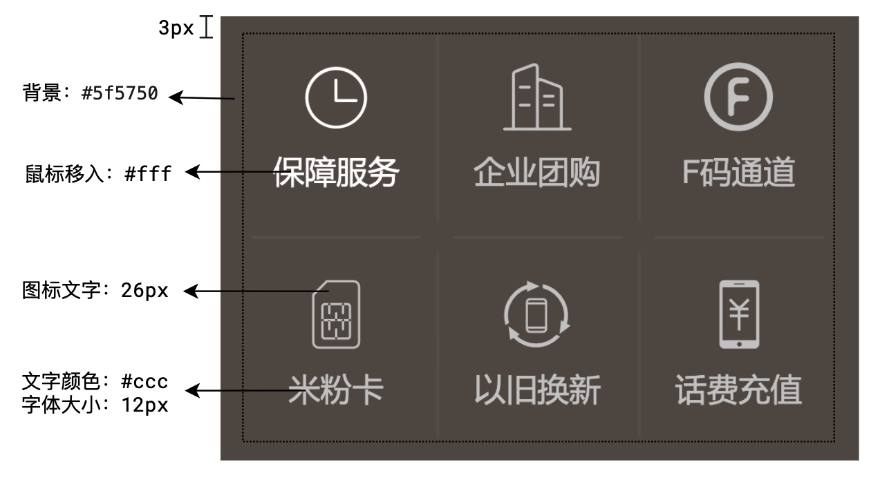
样式标注
1
2
3
4
5
6
7
8
9
10
11
12
13
14
15
16
17
18
19
20
21
22
23
24
25
26
27
28
29
30
31
32
33
34
35
36
37
38
39
40
41
42
43
44
45
46
47
48
49
50
51
52
53
54
55
56
57
58
59
60
61
62
63
64
65
66
67
68
69
| .banner2{
margin-top: 14px;
margin-bottom: 26px;
}
.banner2-service{
width: 234px;
height: 170px;
margin-right: 14px;
}
.banner2-item{
width: 316px;
height: 170px;
margin-right: 15px;
}
.banner2-item img{
width: 100%;
height: 100%;
}
.banner2-item:last-child{
margin-right: 0;
}
.banner2-service{
background: ##5f5750;
padding: 3px;
font-size: 12px;
color: ##cccccc;
}
.banner2-service a:hover{
color: ##fff;
}
.banner2-service .iconfont{
font-size: 26px;
display: block;
}
.banner2-service a{
width: 76px;
height: 82px;
text-align: center;
padding-top: 10px;
position: relative;
}
.banner2-service a:before{
content: '';
position: absolute;
width: 1px;
height: 70px;
background: ##665e57;
left: 0;
top: 6px;
}
.banner2-service a:after{
content: '';
position: absolute;
width: 64px;
height: 1px;
background: ##665e57;
left: 6px;
bottom: 0
}
.banner2-service a:nth-child(3n+1)::before{
content: none;
}
.banner2-service a:nth-child(n+4)::after{
content: none;
}
|
广告
这个太过于简单
1
2
3
4
5
6
7
8
9
10
11
12
13
| .banner3 img{
margin-top: 20px;
width: 100%;
}
.banner3{
display: block;
}
.main{
background: ##f5f5f5;
padding:22px 0;
}
|
这里就不多说了一个div里面包裹着一个img
主区域-橱窗
样式标注
1
2
3
4
5
6
7
8
9
10
11
12
13
14
15
16
17
18
19
20
21
22
23
24
25
26
27
28
29
30
31
32
33
34
35
36
37
38
39
40
41
42
43
44
45
46
47
48
49
50
51
52
53
54
55
56
57
58
59
60
61
62
63
64
65
|
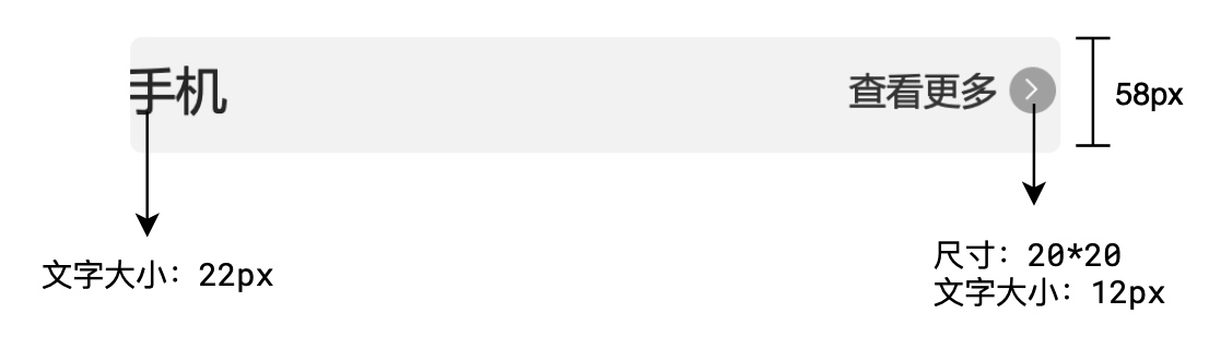
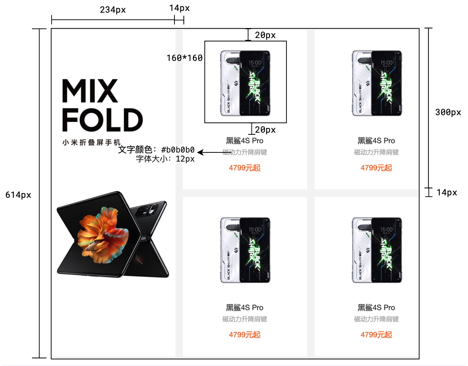
<div class="sc container">
<div class="sc-top clearfix">
<h2 class="sc-title fl">手机</h2>
<a href="" class="more fr">查看更多
<i class="iconfont i-right"></i>
</a>
</div>
<div class="sc-container clearfix">
<div class="sc-item-first fl">
<a href="">
<img src="./img/mobile-first.webp" alt="">
</a>
</div>
<div class="sc-item-list fl">
<a href="" class="sc-item">
<img src="./img/heisha.webp" alt="">
<p class="sc-name">黑鲨4s pro</p>
<p class="sc-desc">磁动力升降</p>
<p class="sc-price">4799元气</p>
</a> <a href="" class="sc-item">
<img src="./img/heisha.webp" alt="">
<p class="sc-name">黑鲨4s pro</p>
<p class="sc-desc">磁动力升降</p>
<p class="sc-price">4799元气</p>
</a> <a href="" class="sc-item">
<img src="./img/heisha.webp" alt="">
<p class="sc-name">黑鲨4s pro</p>
<p class="sc-desc">磁动力升降</p>
<p class="sc-price">4799元气</p>
</a> <a href="" class="sc-item">
<img src="./img/heisha.webp" alt="">
<p class="sc-name">黑鲨4s pro</p>
<p class="sc-desc">磁动力升降</p>
<p class="sc-price">4799元气</p>
</a> <a href="" class="sc-item">
<img src="./img/heisha.webp" alt="">
<p class="sc-name">黑鲨4s pro</p>
<p class="sc-desc">磁动力升降</p>
<p class="sc-price">4799元气</p>
</a> <a href="" class="sc-item">
<img src="./img/heisha.webp" alt="">
<p class="sc-name">黑鲨4s pro</p>
<p class="sc-desc">磁动力升降</p>
<p class="sc-price">4799元气</p>
</a> <a href="" class="sc-item">
<img src="./img/heisha.webp" alt="">
<p class="sc-name">黑鲨4s pro</p>
<p class="sc-desc">磁动力升降</p>
<p class="sc-price">4799元气</p>
</a> <a href="" class="sc-item">
<img src="./img/heisha.webp" alt="">
<p class="sc-name">黑鲨4s pro</p>
<p class="sc-desc">磁动力升降</p>
<p class="sc-price">4799元气</p>
</a> <a href="" class="sc-item">
<img src="./img/heisha.webp" alt="">
<p class="sc-name">黑鲨4s pro</p>
<p class="sc-desc">磁动力升降</p>
<p class="sc-price">4799元气</p>
</a>
</div>
</div>
</div>
|
页脚
部分HTML内容
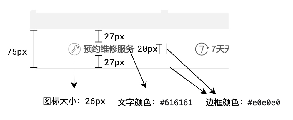
页脚顶部服务支持
1
2
3
4
5
6
7
8
9
10
11
12
13
14
15
16
17
18
19
20
| <a class="fl" href="">
<i class="iconfont i-weixiu1"></i>
预约维修服务
</a>
<a class="fl" href="">
<i class="iconfont i-7tianwuliyoutuihuo"></i>
7天无理由退货
</a>
<a class="fl" href="">
<i class="iconfont i-tian"></i>
15天免费换货
</a>
<a class="fl" href="">
<i class="iconfont i-liwu"></i>
满69包邮
</a>
<a class="fl" href="">
<i class="iconfont i-didian"></i>
520余家售后网点
</a>
|
页脚底部链接
1
2
3
4
5
6
7
8
9
10
11
12
13
14
15
16
17
18
19
20
21
22
23
24
25
26
27
28
29
30
31
32
33
34
35
36
37
38
39
| <div class="footer-links fl">
<h3>帮助中心</h3>
<a href="">账号管理</a>
<a href="">购物指南</a>
<a href="">订单操作</a>
</div>
<div class="footer-links fl">
<h3>服务支持</h3>
<a href="">售后政策</a>
<a href="">自助服务</a>
<a href="">相关下载</a>
</div>
<div class="footer-links fl">
<h3>线下门店</h3>
<a href="">小米之家</a>
<a href="">服务网点</a>
<a href="">授权体验店/专区</a>
</div>
<div class="footer-links fl">
<h3>关于小米</h3>
<a href="">了解小米</a>
<a href="">加入小米</a>
<a href="">投资者关系</a>
<a href="">企业社会责任</a>
<a href="">廉洁举报</a>
</div>
<div class="footer-links fl">
<h3>关注我们</h3>
<a href="">新浪微博</a>
<a href="">官方微信</a>
<a href="">联系我们</a>
<a href="">公益基金会</a>
</div>
<div class="footer-links fl">
<h3>特色服务</h3>
<a href="">F 码通道</a>
<a href="">礼物码</a>
<a href="">防伪查询</a>
</div>
|
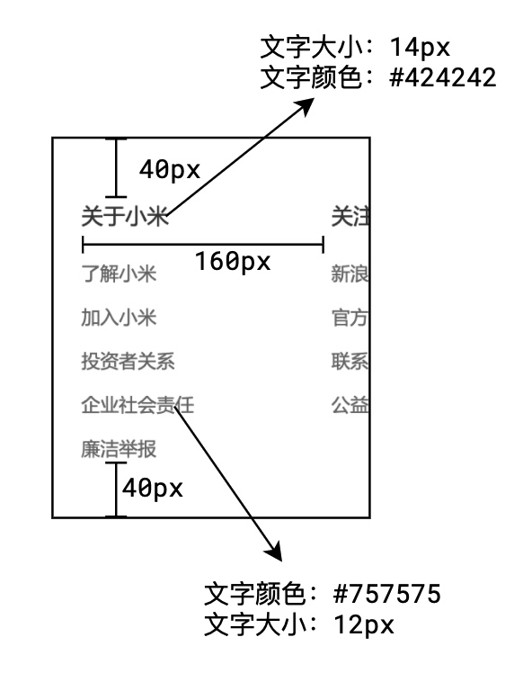
样式标注
1
2
3
4
5
6
7
8
9
10
11
12
13
14
15
16
17
18
19
20
21
22
23
24
25
26
27
28
29
30
31
32
33
34
35
36
37
38
39
40
41
42
43
44
45
46
47
48
49
50
51
52
53
54
55
56
57
58
59
60
61
62
63
64
65
66
67
68
69
70
71
72
73
74
75
76
77
78
79
80
81
|
.footer-top{
padding: 27px 0;
border-bottom: 1px solid ##e0e0e0;
height: 75px;
color: ##616161;
}
.footer-top a{
width: 20%;
font-size: 16px;
text-align: center;
}
.footer-top .iconfont{
font-size: 26px;
vertical-align: -4px;
}
.footer-top a:last-child{
border-right: none;
}
.footer-bottom{
padding: 40px 0;
}
.footer-links{
width: 160px;
color: ##424242;
}
.footer-links h3{
font-size: 14px;
font-weight: normal;
color: ##424242;
margin-bottom: 17px;
}
.footer-links a{
display: block;
margin-top: 10px;
}
.footer-contact{
width: 245px;
text-align: center;
border-left: 1px solid ##e0e0e0;
font-size: 12px;
}
.footer-phone{
font-size: 22px;
color: ##ff6700;
}
.footer-phone-desc{
color: ##616161;
}
.footer-support{
width: 118px;
border: 1px solid ##ff6700;
color: ##ff6700;
display: block;
margin: 3px auto;
height: 30px;
line-height: 30px;
}
.footer-support .iconfont{
vertical-align: -2px;
font-size: 14px;
}
.footer-support:hover{
background: ##ff6700;
color: ##fff;
}
.footer-subcribe{
color: ##616161;
}
.footer-subcribe .iconfont{
font-size: 20px;
vertical-align: middle;
cursor: pointer;
}
.footer-subcribe .iconfont:hover{
color: ##ff6700;
}
|
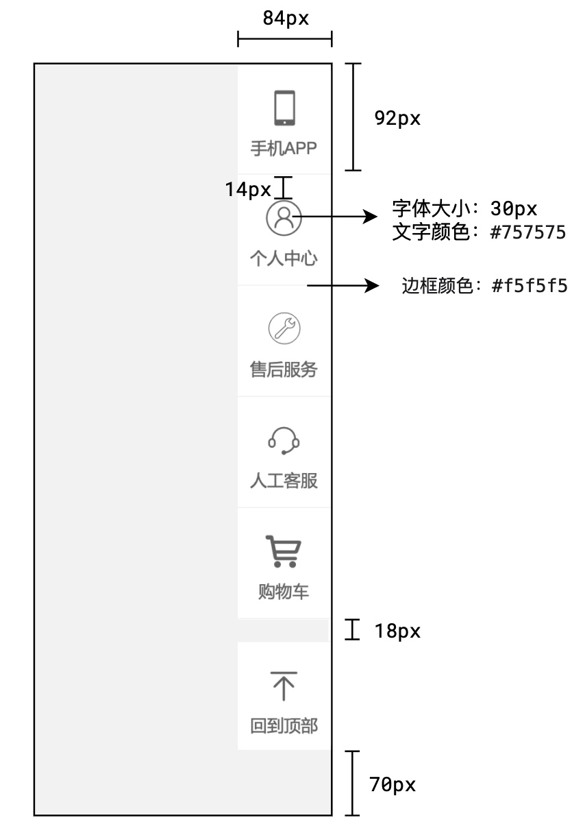
右侧固定菜单
部分HTML内容
1
2
3
4
5
6
7
8
9
10
11
12
13
14
15
16
17
18
19
20
21
22
23
24
| <div class="rm-item">
<i class="iconfont i-tel"></i>
<span class="rm-title">手机APP</span>
</div>
<div class="rm-item">
<i class="iconfont i-yonghu"></i>
<span class="rm-title">个人中心</span>
</div>
<div class="rm-item">
<i class="iconfont i-weixiu1"></i>
<span class="rm-title">售后服务</span>
</div>
<div class="rm-item">
<i class="iconfont i-kefu"></i>
<span class="rm-title">人工客服</span>
</div>
<div class="rm-item">
<i class="iconfont i-car"></i>
<span class="rm-title">购物车</span>
</div>
<div class="rm-item">
<i class="iconfont i-dingbu"></i>
<span class="rm-title">回到顶部</span>
</div>
|
样式标注
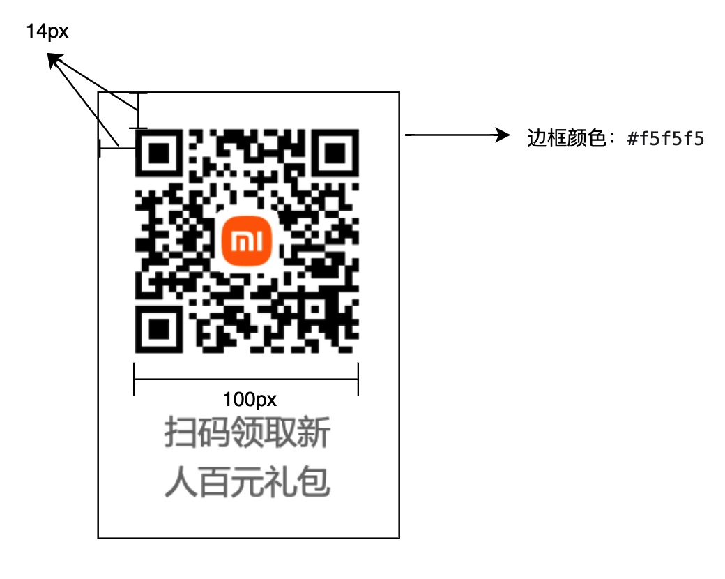
右侧二维码弹出
样式标注
总结
至此所有的代码就已经写完了。
源码下载地址:http://love.guoyaxue.top/pan/down.php/5374c89987b641903948ea136dd38f22.zip
源码演示地址
https://effect.guoyaxue.top/html_css/index.html


